
Cross-Device Testing for Dark Mode Consistency
Practical testing methods to ensure your dark mode works correctly across Chrome, Safari, Firefox, and Edge on Singapore’s most common devices.


Why Testing Matters More Than You Think
You’ve designed a beautiful dark mode interface. Colors look perfect on your monitor, contrast passes WCAG standards, and the toggle switch feels smooth. But here’s the thing — what you see on your MacBook Pro isn’t what your users see on their budget Android phone or older iPad.
Dark mode rendering varies wildly across devices. Different browsers handle CSS custom properties differently. Some phones oversaturate colors in dark environments, others crush blacks into absolute nothingness. Safari on iOS applies its own system-level adjustments that can break your carefully calibrated color palettes.
This is why cross-device testing isn’t optional — it’s fundamental. You’re not just checking if dark mode exists. You’re verifying that the experience remains consistent, readable, and intentional across the actual devices your Singaporean audience is using right now.

Building Your Testing Strategy
Start with a realistic device matrix. You’re not testing on every phone ever made — that’s impossible. Instead, focus on the devices that represent 85% of your actual traffic.
For Singapore specifically, that means iPhone 12-15 Pro models, Samsung Galaxy S23-S24 range, and iPad Air/Pro. On desktop, it’s primarily MacBook Air/Pro, Dell XPS, and HP Pavilion machines. Don’t forget older devices either — plenty of users still run iPhone 11s or Galaxy A series phones. They’re in your analytics. They deserve testing.
The Core Device Matrix
- 3-4 recent iOS devices (iPhone 14/15)
- 3-4 recent Android phones (Samsung, Google Pixel)
- 2 tablets (iPad and Android)
- 3-4 desktop machines (Mac, Windows, Linux)
Browser testing gets more specific. Chrome dominates globally at 65% market share, Safari takes 25% on mobile, Firefox sits around 3%, and Edge claims the remaining desktop users. Test on all four. Each one renders dark mode differently.

Testing Methods That Actually Work
1
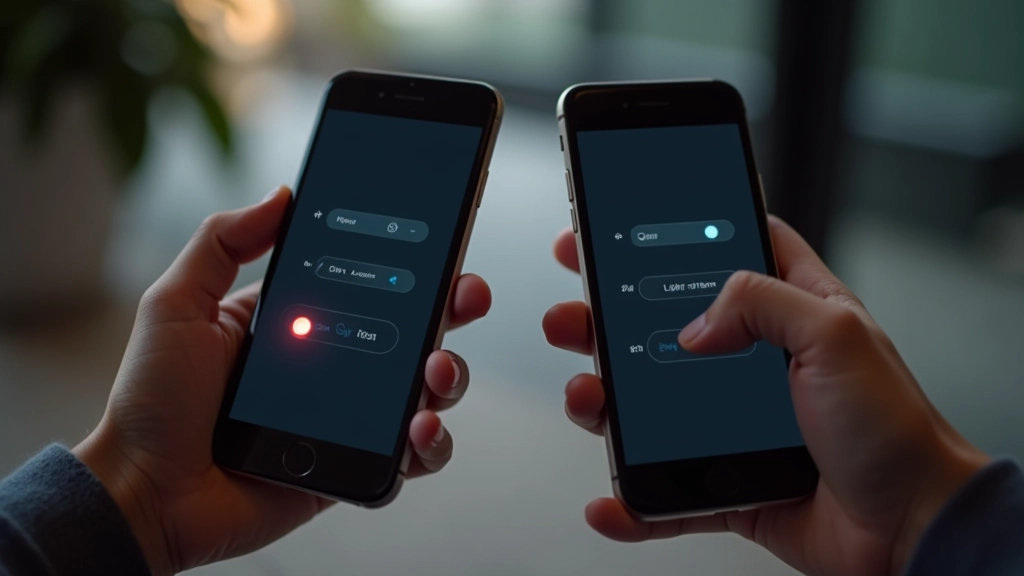
Physical Device Testing
There’s no substitute. You need real phones and tablets in your hands, in actual lighting conditions. Testing in a dark room is different from testing in a bright office. The ambient light affects how colors appear on device screens — this is critical information you’ll miss with simulators.
Open your dark mode interface on each device. Look at the contrast. Does text blur slightly? Do colors feel different? Take screenshots using the device’s native screenshot tool — don’t photograph the screen with another camera. Native screenshots show you exactly what’s rendering.
2
Browser DevTools Testing
Chrome DevTools has a built-in dark mode simulator. Open DevTools, press Ctrl+Shift+P (Cmd+Shift+P on Mac), search for “Rendering”, then toggle “Emulate CSS media feature prefers-color-scheme”. This shows you how your site renders when a user has dark mode enabled at the OS level.
Safari’s equivalent is in Develop Enter Responsive Design Mode then the menu icon Dark Appearance. Firefox has about:preferences but relies more on the system setting. The key point? Each browser interprets the media query slightly differently. You need to test on all of them.
3
Color Contrast Verification
Use WebAIM’s contrast checker or Stark in Figma. Run it on every text element, button, and interactive component. Dark mode has different contrast requirements than light mode because the human eye perceives dark backgrounds differently.
WCAG AA requires 4.5:1 contrast for normal text. Some designers think they can get away with 3.5:1 in dark mode. You can’t. Your users with any vision impairment will struggle. Run contrast checks systematically — don’t guess.
Common Issues You’ll Find
- Color shifts: Colors that look perfect on desktop appear oversaturated or desaturated on phones
- Black crushing: Pure black (#000000) disappears on some OLED screens, making text invisible
- Border visibility: Subtle borders meant for light backgrounds become invisible in dark mode
- Transparency issues: Semi-transparent overlays render differently across browsers and OS versions
- System theme conflicts: User’s OS dark mode settings override your CSS in some browsers
Important Note on Testing Standards
This guide provides educational information about cross-device dark mode testing practices. Actual implementation requirements vary based on your project’s scope, audience, and accessibility standards. Always consult WCAG guidelines and test with real users from your target demographic. Device and browser capabilities evolve — what’s current in March 2026 may change with new OS releases.
Your Testing Checklist
Before you ship dark mode, work through this list. It takes about 2-3 hours depending on your codebase size. Worth every minute.
Test on at least one device from each category (iOS, Android, macOS, Windows)
Verify dark mode works in Chrome, Safari, Firefox, and Edge
Check contrast ratio on every text element (aim for 4.5:1 minimum)
Test form inputs — labels, placeholders, and borders must be visible
Verify images don’t lose detail in dark mode (check shadows and subtle elements)
Test the toggle switch — ensure it works reliably and preference persists
Check focus states and active states on buttons and links
Test in different lighting conditions (bright room, dim room, outdoor sunlight)

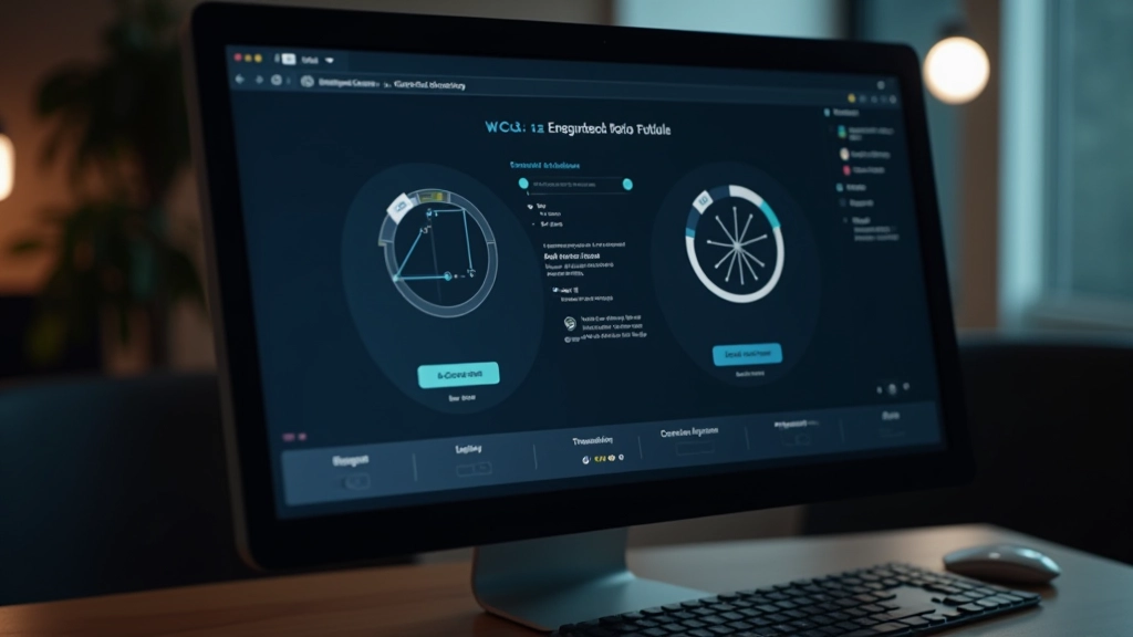
Automating What You Can
Manual testing catches the nuances, but automation catches the obvious mistakes. Use tools like axe DevTools or Lighthouse to run automated accessibility checks. They’ll flag contrast failures instantly. They won’t catch subtle color shift issues, but they’re fast and reliable for the basics.
Set up automated screenshot testing with tools like Percy or BackstopJS. You take reference screenshots of your site in dark mode on different viewports, then the tool compares future screenshots against those baselines. Any pixel-level change gets flagged. This catches unintended color shifts that human eyes might miss.
Git hooks are your friend. Before anyone commits CSS changes, run a contrast check. If it fails the check, the commit gets blocked. This prevents dark mode regressions from sneaking into production. Pair this with your CI/CD pipeline and you’ve got solid protection.

Testing Is Part of Design, Not After It
Here’s what separates competent dark mode implementations from great ones: testing happens during design, not as a final checkbox. You’re making color decisions knowing exactly how they’ll render on iPhone 14 OLED. You’re adjusting contrast while you’re still in Figma, before any code gets written.
This shifts the entire workflow. You’re not designing in isolation on your 27-inch MacBook Pro with perfect lighting. You’re designing with the constraints of real devices, real browsers, real users in mind. It’s more work upfront. It saves enormous amounts of rework later.
Start small if you need to. Test on one iOS device and one Android device. Test in Chrome and Safari. Run a contrast check. That’s the minimum viable dark mode testing process. Build from there. Add more devices, more browsers, more automation as your product scales.
Your users in Singapore, whether they’re browsing at 11 PM on an iPhone 15 or checking your site on a work desktop running Windows, they’ll see exactly what you intended. That consistency is worth the testing effort.
Related Resources