Designing Seamless Theme Toggle Switches
Step-by-step approach to building toggle switches that feel natural and preserve user preference across sessions.
Read ArticleLearn how to select accent colors and backgrounds that maintain readability without causing eye fatigue when users browse at night. We’ll explore contrast ratios, color temperature, and practical techniques for creating palettes that feel comfortable in any lighting condition.


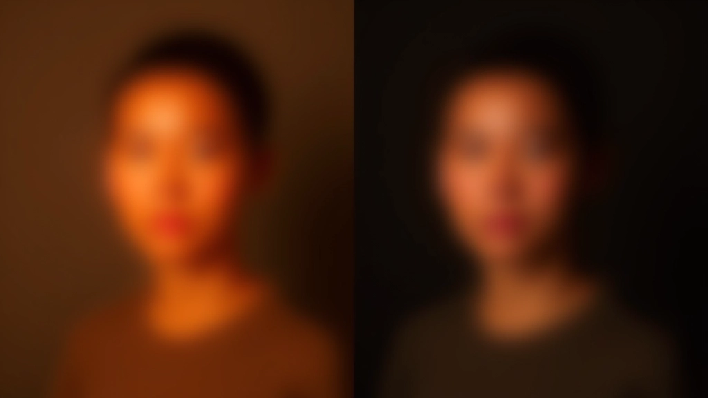
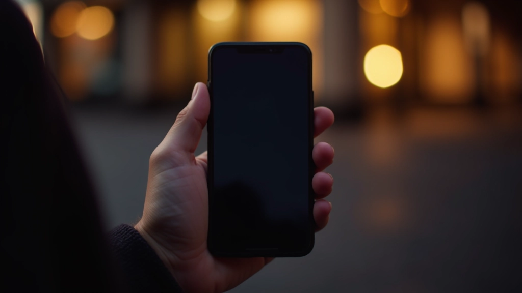
It’s not just about switching from light backgrounds to dark ones. Creating a truly comfortable dark mode requires understanding how colors behave under low-light conditions. When someone’s browsing at 11 PM with the room lights off, their pupils are dilated and their eyes are more sensitive to bright light.
That’s why bright white text on a pure black background, while having perfect contrast ratios, can actually feel harsh and cause eye strain. The contrast is so extreme that it creates a glowing effect that’s uncomfortable for extended viewing. You’ll want softer colors that still meet accessibility standards without feeling aggressive.

Color temperature describes how warm or cool a color appears. In dark mode design, warmer tones (yellows, oranges, warm whites) tend to feel more comfortable for evening viewing than cool tones (blues, cool whites). This isn’t arbitrary — it’s based on how our circadian rhythms respond to light.
A color temperature around 3000-4000K feels natural and comfortable. That’s why many dark mode interfaces use off-white backgrounds (like #1a1a1a or #0f1419) instead of pure black. The slight warmth reduces the harshness without compromising the dark aesthetic.
Pro tip: Use background colors with slight warm undertones. Instead of #000000, try #0c0a09. Instead of #ffffff, try #fff7ed. The difference is subtle but makes a real impact on comfort.

This article provides educational information about dark mode design principles and color selection for web interfaces. These are general guidelines based on design best practices and accessibility standards (WCAG 2.1). Individual user preferences, display types, and lighting conditions vary significantly. Always test your color palettes with real users and devices to ensure they work well in your specific context. For medical concerns related to eye strain or visual discomfort, consult a qualified eye care professional.
WCAG 2.1 requires a minimum contrast ratio of 4.5:1 for normal text. That’s your baseline. But here’s where it gets interesting — you can exceed this requirement while still being comfortable at night.
The sweet spot for dark mode text is usually around 6:1 to 7:1 contrast. That’s higher than the minimum but lower than the stark 21:1 you’d get with pure white on pure black. Softer grays like #fdba74 on #0c0a09 give you that extra contrast buffer for accessibility while feeling less aggressive.
Accent colors are where most designers go wrong with dark mode. A vibrant #ff5722 might look great in mockups, but at 11 PM on a phone, it’s practically glowing off the screen. You’re not designing for a bright studio — you’re designing for bedside reading.
Desaturate your accents slightly. If you’d normally use #ea580c, try #c2410c for dark mode. It’s the same hue family but feels more restrained. The orange still pops against dark backgrounds, but it won’t cause that uncomfortable brightness sensation. Test in actual low-light conditions — not in a well-lit office with your brightness cranked up.
Testing trick: Reduce your monitor brightness to 40% and dim your room lights. If your accent color still feels comfortable to look at for 5 minutes, you’ve probably got it right.
Start with your base. Choose a dark background (around #0c0a09 to #1c1917) that feels neutral to you. Then pick your primary text color — something between #fff7ed and #f5f5f5 works well for most interfaces. Don’t use pure white unless you’re aiming for maximum contrast on accessibility-critical elements.
For secondary text and muted content, go slightly darker than your primary text. #fdba74 or #f97316 work nicely as secondary text that’s still readable but visually distinct. Then choose your accent colors for interactive elements. These should be desaturated versions of your brand colors — warmer than cool.
Test everything in actual darkness. Your phone’s night mode isn’t enough. Go to a dark room, turn off the lights, and look at your palette on the actual devices your users will be using. iPad screens behave differently from iPhone screens. Android displays differ from iPhones. You’ll spot issues that mockups never reveal.
All the theory and guidelines won’t matter if your palette fails in the real world. That’s why the most important step is testing with actual users in actual low-light conditions. Ask someone to use your interface at night. Watch where they struggle. Listen when they say colors feel too bright or too dim.
Dark mode design isn’t about looking cool — it’s about making interfaces genuinely comfortable for people who’re using them when they’re tired, in bed, or in environments where bright light is the last thing they need. When you get it right, users won’t think about your color choices at all. They’ll just feel comfortable.