
Building Color Palettes That Work in Low Light
Learn how to select accent colors and backgrounds that maintain readability with reduced eye strain during evening browsing sessions.
Step-by-step approach to building toggle switches that feel natural and preserve user preferences across sessions without breaking the experience.
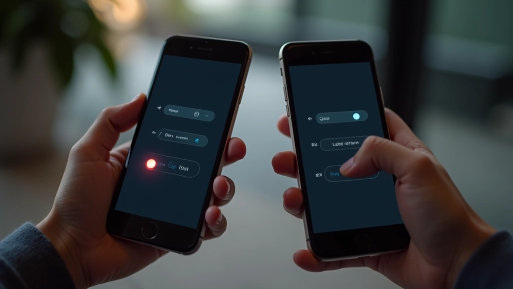

Dark mode isn’t optional anymore. Users expect it. They’ll open your app at night, squint at the bright white screen, and immediately look for a toggle. That’s your moment to get it right.
But here’s the thing — building a toggle isn’t just about adding a button. You’re managing user preference, syncing it across sessions, updating the entire interface instantly, and making sure nothing breaks. It’s actually more complex than it looks. We’ll walk through the exact approach we use on production sites across Singapore and beyond.

Your toggle needs three things to work properly: detection, persistence, and instant application. Let’s break each down.
First, you’ve got to know what the user prefers. Most sites check in this order: saved preference in localStorage, system preference via
prefers-color-scheme
, or default to light. That’s it. Three checks, done.
When someone flips the toggle, you’re not just changing the interface — you’re saving that choice. LocalStorage is perfect for this. It’ll survive a page refresh, a new tab, even coming back tomorrow. No database needed.
The switch happens instantly. We’re talking milliseconds. You update a CSS class on the root element, and every component respects the change. No flickering. No loading states. Just smooth, immediate transformation.


The actual switch is simpler than the infrastructure behind it. You need a clickable element — could be a checkbox input styled as a switch, could be a button. The visual doesn’t matter as much as the behaviour.
Key Point: Don’t overcomplicate the toggle. A simple input with CSS styling works perfectly. Add a label for accessibility. Make sure the toggle’s accessible to keyboard users and screen readers.
The toggle should be obvious and always available. Top-right corner is traditional, but we’ve seen it work in navigation headers, footers, and even as a floating button on the side. Place it where users naturally look for settings.
Note: This guide covers the user interface and preference management aspects of theme toggling. Implementation specifics vary depending on your tech stack — the principles remain consistent whether you’re building with React, Vue, vanilla JavaScript, or server-side rendering. Always test your theme toggle across actual devices and browsers used by your target audience to ensure smooth transitions and preference persistence.
This is where dark mode gets elegant. Instead of maintaining two separate stylesheets, you define colors as CSS variables. Light mode gets one set of values. Dark mode gets another. The toggle just switches between them.
We typically structure it like this: define all color variables at the root level, then override them when a
dark-mode
class is present. Every color-dependent element automatically respects the change. No manual updates needed. It’s maintainable and scales beautifully as your design system grows.
The bonus? CSS variables work in every modern browser. You’re not dealing with polyfills or fallbacks. Just solid, dependable colour management that’s been standard for years now.


You’ve built the toggle. Now comes the real work. Does it actually work on an iPhone 14? What about that older Android tablet someone’s still using? Does it work in Chrome, Safari, Firefox, and Edge?
Test on real devices when you can. If you can’t, use browser DevTools to emulate different screen sizes and pixel densities. Toggle between light and dark mode. Refresh the page — does the preference stick? Navigate to different sections — does the theme follow? Load the site in a new incognito window — does the system preference kick in?
Testing Checklist: Preference persists after refresh. Theme applies instantly without flashing. Works on mobile and desktop. Respects system preference on first visit. Toggle remains accessible and obvious.
A seamless theme toggle isn’t complicated once you understand the three components: detecting preference, saving it, and applying it instantly across your entire interface. You’re not building something revolutionary. You’re building something reliable that your users expect.
The best toggles are the ones users forget about — they’re just there, they work, and the site respects whatever they choose. That’s the goal. Keep it simple, test thoroughly, and your users will appreciate it every single time they open your site in the evening.